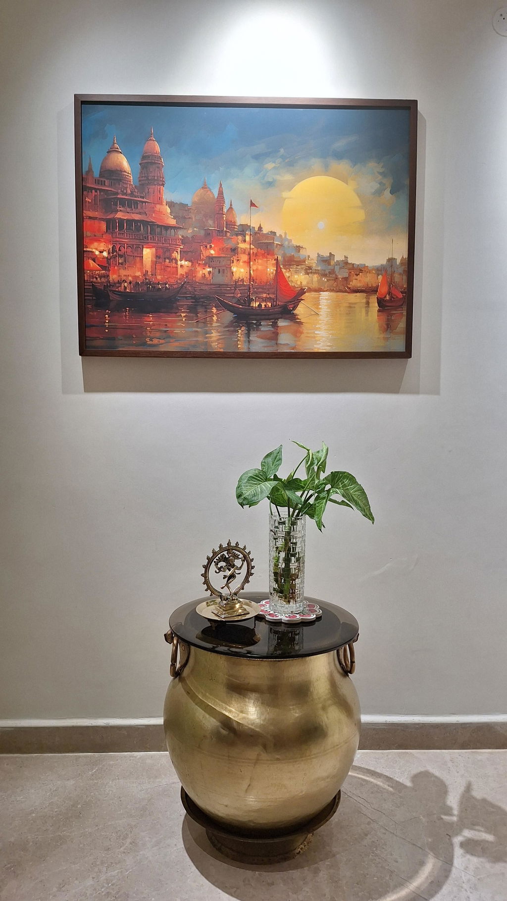
Frame Colour Guide: How to Choose the Right Frame for Your Room
Choosing a painting is only half the decision. The frame can change how the artwork looks against your wall, how it connects with your furniture, and whether the overall space feels modern, traditional or somewhere in between.
A black frame can make colours look sharper, a gold finish can add warmth, and a natural wood frame can make a room feel more relaxed. But the best choice is not always the one that matches your furniture exactly. It is the one that brings the artwork and the room together without making either feel out of place.
At TravelArty, framing options include artisanal wood framing in Italian birchwood and pine wood. Here is how to choose a frame colour and material that works for your home.
Why Frame Colour Matters as Much as the Art Itself
Think of a frame as the finishing detail of a painting. It creates a visual boundary between the artwork and the wall, helping the image stand out.
A black frame works particularly well with monochrome photography, cityscapes, abstract artwork and paintings with strong outlines. It creates a clean edge that suits contemporary interiors.

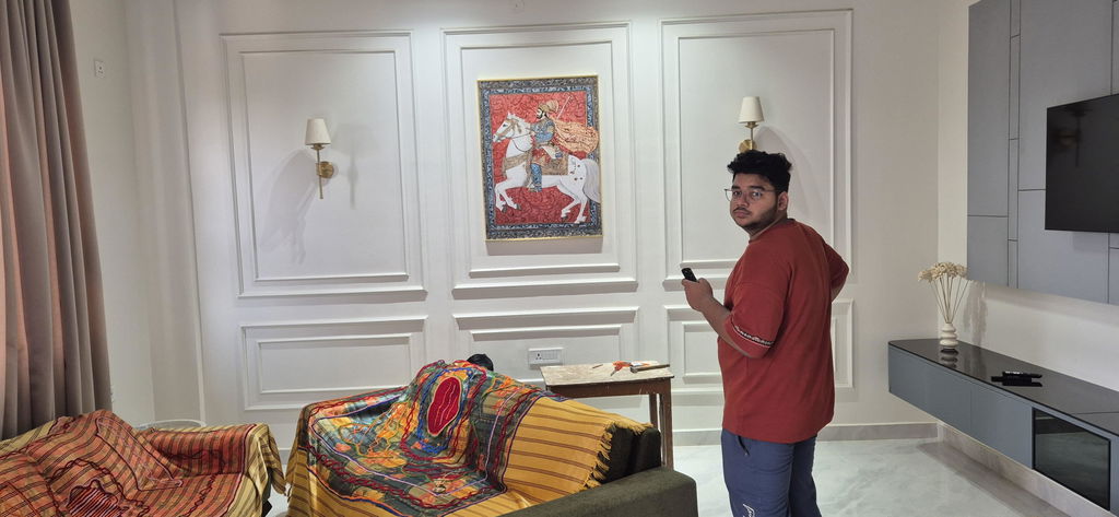
Gold and champagne-toned finishes work beautifully with traditional Indian artwork, detailed florals and paintings with rich reds, greens or blues. They can add a decorative touch without requiring additional accessories.

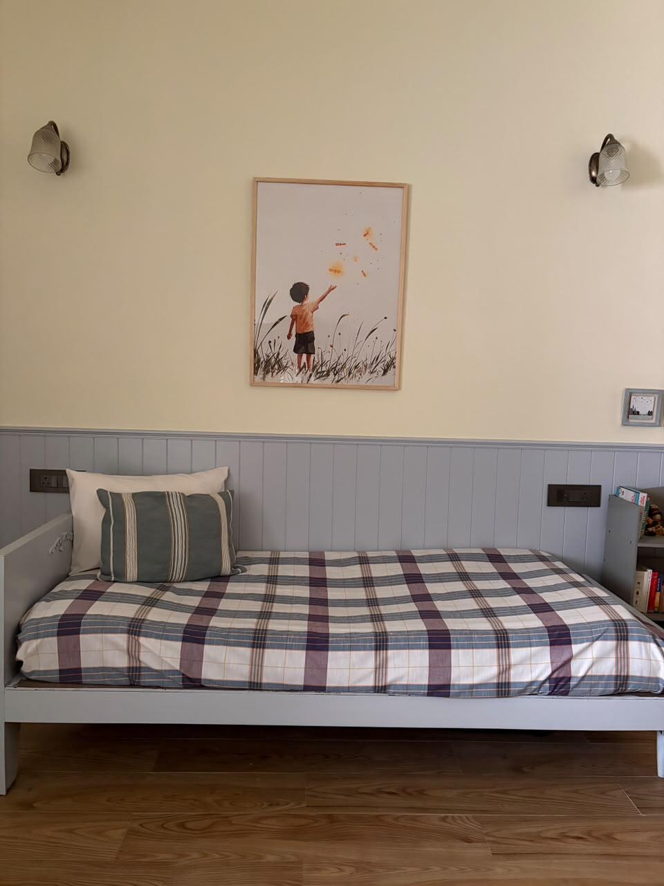
Natural wood frames offer a different effect. Instead of creating a strong contrast, they connect the artwork with wooden furniture, flooring and other natural textures.

One useful rule: choose your frame based on the artwork and the room together. A frame that looks beautiful on a white background may feel too heavy against a dark green wall.
How to Choose Frames for Warm-Toned Rooms
Warm-toned rooms often feature beige, cream, terracotta, brown, rust, mustard and warm wood. These colours already create a welcoming atmosphere, so your frame should complement that warmth.
Natural wood frames: A natural wood finish is an excellent choice for rooms with oak-toned furniture, cane chairs, linen upholstery or earthy wall colours. It gives landscapes, botanical prints and travel-inspired artwork a relaxed, organic appearance.

Gold or champagne finishes: These work well with traditional Indian paintings, ornate subjects and artwork featuring warm colours. Against cream or beige walls, a gold-toned frame can make the artwork feel more considered and decorative.
Black frames: If your room has warm colours but feels visually busy, a black frame can provide definition. It is particularly effective around artwork with darker details or strong colour contrasts.
For example, a painting of the Benares Ghats can work beautifully in a warm living room. A natural wood frame creates a softer, heritage-inspired look, while a dark frame gives the same artwork a more defined, contemporary appearance.
The important point is not to match every brown or gold detail in the room. One or two visual connections are usually enough.
How to Choose Frames for Cool-Toned and Neutral Rooms
Cool-toned interiors often feature grey, white, blue, sage green and cooler neutrals. These spaces can benefit from frames that create contrast or introduce a little warmth.
Black frames are a reliable choice for minimalist rooms. They look crisp against white walls and can bring structure to abstract art, architectural prints and modern cityscapes.
Light natural wood frames soften cool interiors. If your room has grey upholstery, white walls and simple furniture, a lighter wood finish can prevent the space from feeling too stark.
Gold-toned frames can introduce warmth into a predominantly cool palette. They work especially well when the artwork contains cream, muted green, navy or soft pink.
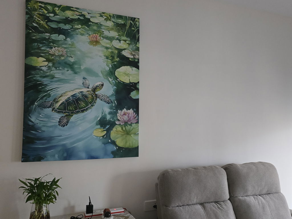
For a bedroom with white walls, grey bedding and light wood furniture, consider a landscape painting in a light wood frame. If you prefer a sharper, more modern look, choose black.
Do not assume every frame must match the furniture. Sometimes a little contrast is exactly what makes the artwork noticeable.
Italian Birchwood vs Pine Wood: What's the Difference?
Wood framing is not a single style. The species, finish and frame profile all influence the final appearance. TravelArty highlights both Italian birchwood and pine wood in its artisanal framing range.
Italian Birchwood Frames
Birchwood is generally known for its relatively fine, even grain and smooth appearance. Depending on the finish, it can provide a clean, refined look that suits contemporary and classic interiors.


Advantages:
-
Refined appearance: Its relatively subtle grain can complement artwork without competing with the image.
-
Versatile styling: It can work well in modern living rooms, bedrooms and carefully styled gallery walls.
-
A clean finish: It is a good material to consider when you want the frame to look polished rather than rustic.
Choose a birchwood option when you want the frame to feel like a considered part of the artwork rather than a decorative feature on its own.
Pine Wood Frames
Pine is commonly associated with a lighter, more casual wood aesthetic. Its visible grain and natural character can bring warmth and texture to a room, depending on the finish used.
Advantages:
-
Natural character: Its grain can add visual interest without requiring an ornate frame design.
-
Relaxed styling: It suits Scandinavian-inspired rooms, casual living spaces and nature-led interiors.
-
Warmth and texture: It can complement botanical prints, landscapes and travel-inspired artwork.
Pine is worth considering when you want a softer, more organic look. However, the final appearance depends on the specific finish and frame profile.
Which should you choose? Do not decide on the wood name alone. Compare the actual frame colour, grain, profile and finish offered for your chosen artwork. Neither material is automatically better for every room, and durability depends on construction and finishing as well as the wood itself.
Can You Mix Frame Colours in One Gallery Wall?
Yes. A gallery wall does not need identical frames to look cohesive. What it needs is a visual connection between the pieces.
The easiest approach is to choose two main frame finishes and repeat them. For example, combine black frames with natural wood frames for a contemporary, relaxed arrangement. Alternatively, use gold-toned frames alongside darker wood finishes for a more traditional look.
You can also mix frame colours while keeping the artwork within a shared colour palette. Travel photographs, landscapes and abstract prints can sit together successfully when their colours or subject matter create a common thread.
A few guidelines help:
-
Repeat each frame colour at least twice where possible.
-
Keep the spacing between artworks consistent.
-
Use similar frame widths if you want a neat, structured arrangement.
-
Avoid introducing too many unrelated finishes in a small gallery wall.
If you are unsure, start with matching frames and introduce one contrasting finish. It is easier to build a balanced arrangement gradually than to correct a wall that feels visually crowded.
Choose the Right Frame for Your Artwork at TravelArty
The right frame should suit the artwork you love and the room where you plan to display it. Black offers definition, gold adds warmth, and natural wood brings an organic quality to interiors.
TravelArty offers multiple framing options across its artwork collections, including artisanal framing in Italian birchwood and pine wood. Explore the available options on individual product pages and consider the frame alongside your wall colour, furniture and overall interior style.
A well-chosen frame does not need to attract more attention than the painting. It simply helps the painting feel at home.
Frequently Asked Questions
Which frame colour is best for a living room?
Black is a versatile choice for contemporary interiors, gold works well with traditional and decorative spaces, and natural wood suits warm, relaxed interiors. The best option depends on the artwork and your room's colour palette.
Should my picture frame match my furniture?
Not necessarily. Your frame should coordinate with the room rather than match every piece of furniture. Repeating a colour or material elsewhere in the space can create a more natural connection.
Is Italian birchwood better than pine wood for picture frames?
Neither is universally better. Birchwood is often chosen for its relatively fine grain and refined appearance, while pine offers a more visibly natural character. The finish, construction and intended style should guide your decision.
Can I use different frame colours in one room?
Yes. Repeating two or three complementary finishes can create a coordinated look. For a gallery wall, consistent spacing and a shared colour palette help bring the frames together.
Where can I find framing options for wall art online?
You can explore artwork and available framing options at TravelArty. Individual product pages display the framing choices available for each piece, so check the options before placing your order.
You can also check;
What size wall art should you hang above your sofa?
Best couple wall art ideas for modern homes